63
components — in code and in Figma
4
density modes — one attribute changes all
3
token formats — CSS, SCSS, Tailwind
100%
test coverage — lines, branches, functions
MIT
engine and components both
Why this exists
You are already paying for a design system.
Most teams do not decide to build one. They build one by accident, a component at a time, and pay for it in ways that never show up on a roadmap.
Three developers build three different buttons.
Nobody meant to. There was no shared one on the day each was needed.
The design file and the app drift apart.
The mockup says 16px, the build says 14px, and by the third release nobody trusts either.
Accessibility becomes a panic before launch.
Contrast and keyboard support get checked at the end, when fixing them costs the most.
A rebrand costs a quarter.
Because the colours live in hundreds of files instead of being derived from one.
Building the layer that fixes all four takes a team the better part of a year. This is that layer.
Density
The same components, from dense dashboard to editorial page.
Most component libraries are tuned for one kind of product. Use them for something denser and everything feels bloated. Use them for something roomier and it feels cramped.
Primitiv has four density modes: Dense, Compact, Comfortable and Spacious. Changing one attribute reflows everything beneath it — spacing, control height, corner radius, even type size. An operations tool and a marketing page can run the same components and both look like they were designed for the job.
data-density="comfortable"Operations
| Name | Owner | Updated | Status |
|---|---|---|---|
| Acquisition funnel | R. Achebe | 2m ago | Live |
| Billing reconciliation | M. Okonjo | 14m ago | Live |
| Churn cohorts | S. Ferreira | 1h ago | Review |
| Dunning retries | L. Haugen | 3h ago | Live |
| Entitlement sync | J. Mwangi | Yesterday | Paused |
| Invoice exports | A. Dubois | Yesterday | Live |
| Seat reassignment | T. Nakamura | 2d ago | Review |
| Usage rollups | K. Brennan | 4d ago | Live |
Editorial
Field notes
What a quarter of drift costs
The team shipped four variants of the same control in a single release, each correct against a different mockup. None of them was wrong on the day it was written.
What it cost was not the building. It was the six weeks afterwards, spent deciding which one was right.
Consistency is cheaper to keep than to recover.
Density and size are different questions
Density is set once, for a product or a region — how tight everything is. Size is set per component — how prominent that one thing should be. They are independent, and they compose.
It is not an all-or-nothing setting. Density is inherited, so you set it once for the whole application, or on any part of a page that needs to be different. A dense table inside a roomy article is one attribute on the table’s container.
Corner radius is worth singling out, because it shows how the system thinks. It is not a value someone assigns per size. It is a fraction of the control’s height, so when density changes the height, the radius follows on its own and stays in proportion.
Colour
Every swatch already knows what text colour goes on it.
The letters on each colour below are not a design flourish. They are the actual text colour the engine chose for that swatch, and every one of them clears its contrast minimum.
That is not a promise we check occasionally. It is a test that runs on every change, across all 100 generated colours in both themes. If a single pairing dropped below the line, the build would stop.
Harmonious, not just legible
Legible is the low bar. The harder problem is that a colour scale should look like one family, and most do not. Ramps tend to wander in hue from one step to the next, a little at a time, which is easy to miss on any single swatch and plain once you lay the whole scale out. Or they lose their colour and fade toward grey.
Neither happens here, and neither is left to judgement. The hue is held fixed by construction, the steps are checked to stay visibly distinct from one another, and a ramp that started greying out would fail its test rather than ship.
Where the colour comes from
The palette is generated rather than picked. A colour engine called Harmoni takes one seed colour per ramp and builds the ten steps around it, deciding the foreground pairings as it goes. Primitiv ships the result, so you get an accessible palette without running anything.
Harmoni is a Figma plugin and a product in its own right, for teams who want to generate their own palettes this way. You do not need it to use Primitiv.
100 generated swatches. Every one has a foreground that clears its contrast minimum, every ramp holds its hue, and no two steps collapse onto the same colour — all checked on every change.
Design and build
Your design file and your code are built from the same tokens.
The Figma library is not a drawing of the components. Both are built from one set of tokens, so they cannot quietly disagree about a colour or a spacing value.
Designers work with the real component sets, at every size and density. Developers get the same components in code. When a token changes, both move.
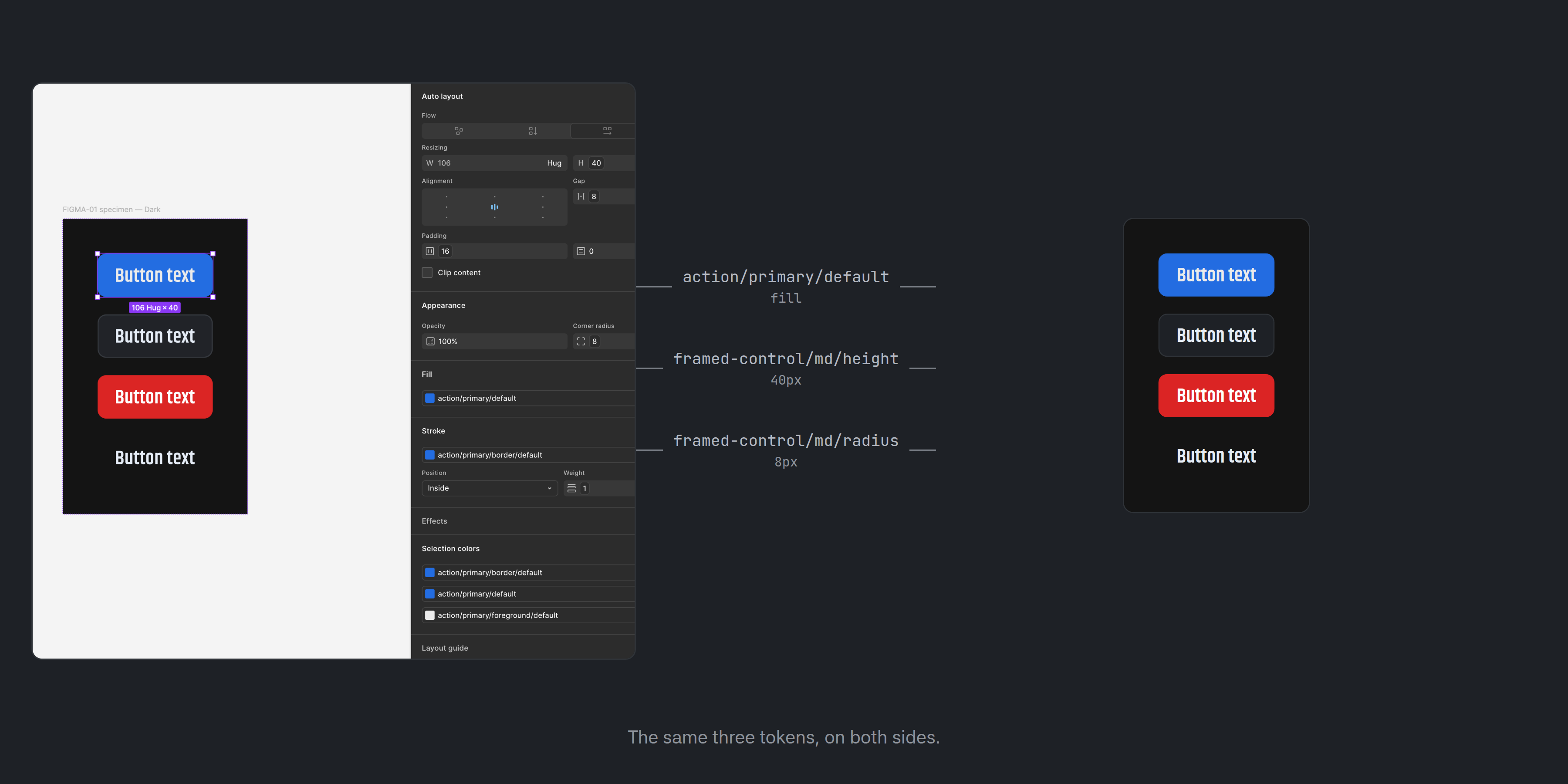
Two things the design file cannot match exactly, and it is better to know now. Figma cannot express CSS grid inside a component slot, so the Grid component is approximated with wrapping. And Aspect Ratio is fixed-pixel in Figma rather than fluid. Everything else is the same on both sides.
Design in Figma →Choose your path
How you consume Primitiv
Headless
Behaviour, props and a11y only. No CSS — you own the styling. Ships as an npm package.
npm i @primitiv-ui/reactpnpm add @primitiv-ui/reactyarn add @primitiv-ui/reactbun add @primitiv-ui/reactStyled (registry)
Headless props plus the style-layer contract and CSS variables. Copied into your app.
npx primitiv add buttonpnpm dlx primitiv add buttonyarn dlx primitiv add buttonbunx primitiv add buttonFigma
Spec and redline content — the design library for building in Figma, powered by Harmoni.
Design in FigmaBuilt in
Accessible by default, not by audit.
Accessibility is not a pass someone does at the end here. It is a property of the components, checked continuously.
Every interactive component follows its WAI-ARIA pattern.
Not an approximation of it.
Keyboard support is part of the component.
Arrow keys, Home and End, Escape, type-ahead. Not something you add afterwards.
Contrast is guaranteed by the engine that generates the colour.
Not spot-checked once the palette is chosen.
Focus is always visible.
On every control, in both themes.
Documentation map
Everything in the docs
On every component page
Installing a component
Button
stableReflects the global mode switch — currently Styled:
npx primitiv add buttonpnpm dlx primitiv add buttonyarn dlx primitiv add buttonbunx primitiv add buttonProps
| Prop | Type | Default | Required |
|---|---|---|---|
| asChild | boolean | false | no |
| children | ReactNode | — | no |
| ref | Ref<HTMLButtonElement> | — | no |
| type | "button" | "submit" | "reset" | "button" | no |